The Paris International Agricultural Show reinvents itself with a modern and inclusive new visual identity.

The evolution in video
This dynamic is reflected in a logo and its variations that are more legible and rounded, with soft, organic, and human shapes—inclusive and able to encompass both the agricultural sector and all audiences.
The colour palette retains its iconic hues while gaining brightness, vibrancy, and modernity. The pictograms have been simplified for greater clarity. The international dimension of the SIA, increasingly evident each year, is now fully embedded in the visual identity with the integration of the world map — a globe as the central element.
Beyond the graphic design, this evolution reflects a strong belief: the SIA is a show in motion, a mirror of agriculture that reinvents itself every day.
Every transformation, whether in physical spaces or visual elements, tells this shared story and highlights the vitality of the agricultural world.
The SIA is evolving, yet remains true to its mission: to be the must-attend event for enthusiasts and professionals alike, fostering dialogue, exchange, encounters, and education.
New Identity – Keywords
- Roundness & humanity: proximity, inclusiveness
- Energy & dynamism: vitality, modernity
- Clarity & readability: simplicity, accessibility
- Colour & freshness: brightness, contemporaneity
- Openness & international: universality, diversity
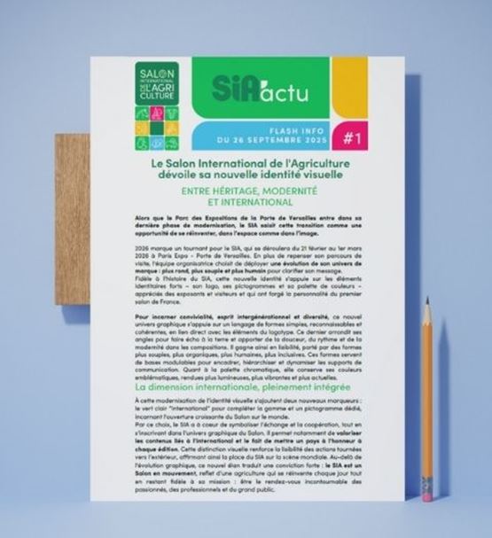
BETWEEN HERITAGE, MODERNITY, AND INTERNATIONAL
This modernization of the visual identity is complemented by two new markers: the light green "International" to complete the color palette and a dedicated pictogram, representing the growing openness of the Salon to the world.
With this choice, the SIA aims to symbolize exchange and cooperation, while fitting within the graphic universe of the Salon. It notably helps highlight international content and the tradition of honoring a country at each edition. This visual distinction strengthens the clarity of actions directed outward, thus affirming the SIA's place on the global stage.
As the Parc des Expositions at Porte de Versailles enters its final phase of modernization, the SIA sees this transition as an opportunity to reinvent itself, both in terms of space and image.